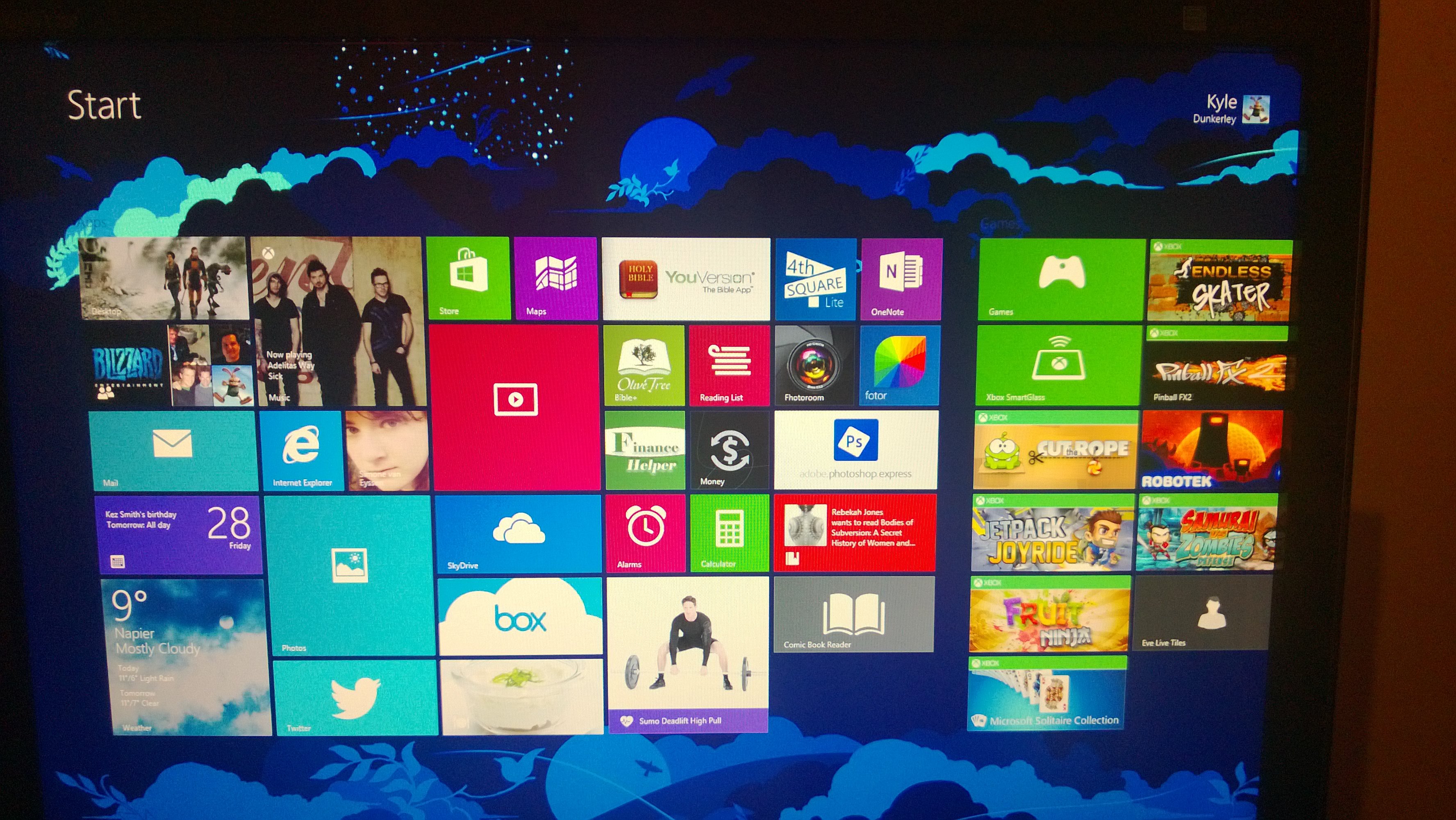
Windows 10 gave everyone back the Start Menu, but unlike most users, I found the Start Screen of Windows 8.1 to be a lot more useful. Live tiles really turned my desktop computer into a dashboard of everything that was important to me. Added with the Facebook and Twitter integration, along with Xbox meant that I kept an eye on everything that I deemed important.
And plus, just look how pretty it was:
So with Windows 10, I was pretty happy to have the Start Screen kept around. Except, I wasn’t. The Start Screen in Windows 10 has a few issues which I would love to get rectified.
Currently, my Start Screen looks like this:
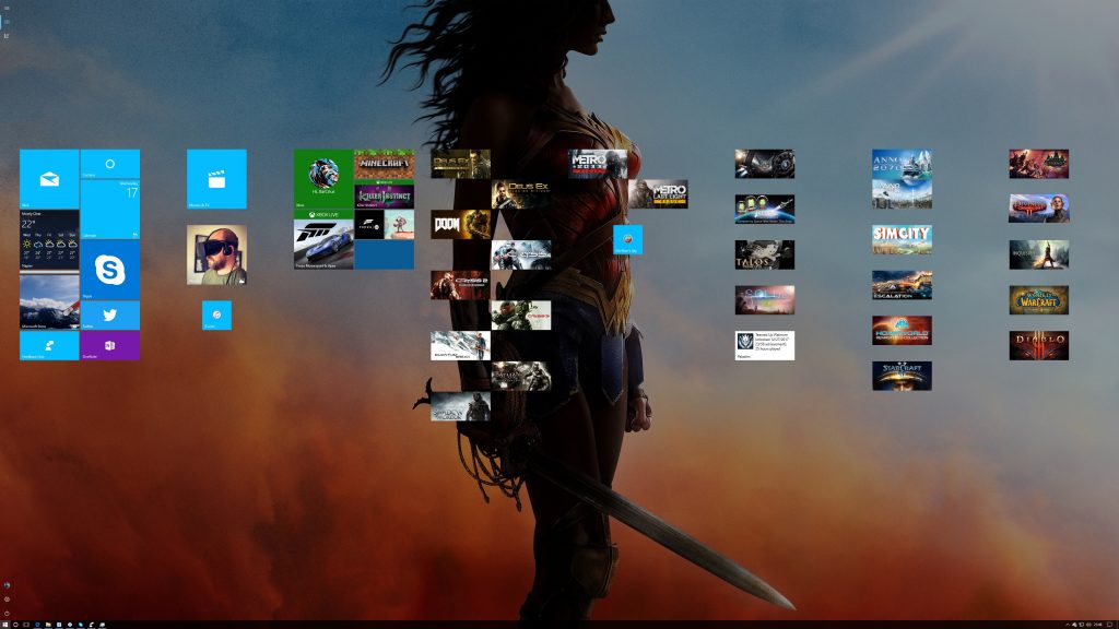
More Live Tiles On Start Screen:
The first thing you notice is that it is not as information dense. This is due to the fact that Windows 10 restricts Live Tiles to 2 wide across at a maximum (or 4 small squares) in a setting you have to turn on. Why does this limitation exist? Thats beyond me. I would love to be able to add just one more wide tile across…
Here is the Feedback hub item for this:
https://aka.ms/Df41rv
Start Screen Scales to 200%:
As someone who uses the Start Screen exclusively (on all my devices – Surface, Laptop, Desktop), I find that when you choose to go Start Screen, it suddenly blows up to 200% zoom. Seriously. I can fit more tiles when I use a Start Menu that’s not taking up the whole screen, compared to when I use a Start Screen… Why is this not a toggle? Is there a reg key I can set?
200% Zoom On Live Tiles:
https://aka.ms/Ds2wb5
All Apps List:
Can you see a problem with this?
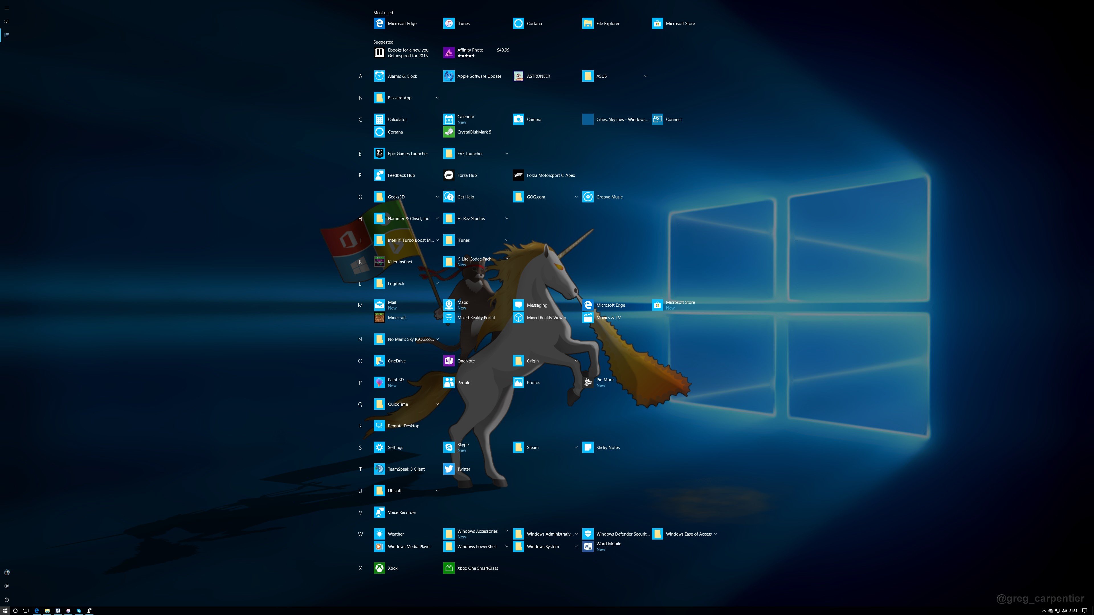
Thats right. The all apps screen is limited to 4 apps across. This is not even fine when working on a Surface due to massive gaps on the left and right. Why not let the apps get closer to the edge?
If you want to please ignore the very terrible spelling mistake…
Here is the All Apps Feedback:
https://aka.ms/H78twz
Moving Multiple Tiles:
Much has been said about this. Much has been written about this. Moving a group of tiles remains one of the more painful experiences on Windows 10. It ranges from tiles overlapping, tiles being re-arranged, tiles stopping responding or even a Start Menu crash. There is a lot of feedback in the feedback hub about this and each and every issue.
Moving Tiles causes Start screen to jump to the top (this is still happening on my Surface, running Windows 10 S Fall Creators Update):
https://aka.ms/Cv5d2w
Persistent Start Screen:
If, like me, you use the Start Screen (and this even happens on the Start Menu), and open multiple apps in succession, wouldn’t it be great if there was an option to keep the Start Screen/Menu up until you click the app on the Taskbar.
https://aka.ms/Emhta1
Boot To Start Screen:
When I start my computer, I want to walk away and come back to my digital dashboard. Not my very empty desktop. Why isn’t this an option yet? And no – Tablet Mode doesn’t cut it because then all my apps are super full screen.
Anyways, here is the feedback for that and its not even mine!
https://aka.ms/M0yqel
Cube Live Tiles:
Right. So who thought this was a good idea? They are called Live Tiles – the word being tiles here. Not cubes, not bricks, but tiles. Oh how I long for the card flip of Windows 8.1. Simply because the Live Cubes do not fit with the flat theme that goes with this modern OS. Think about it… Everything in this OS is flat with layers (thanks Fluent Design!) but now you have a very 3D cube that rotates at you. This animation so 90’s.
This is one of my pet peeves all the way from the very first Insider builds up to now.
https://aka.ms/W7xi7d
Fluent Design On Start Screen:
The Start Menu is full of Fluent Design. And it looks great! Then you change to Start Screen and there is no Fluent for you. Why? Please, give me fluent design on the full screen. Imagine the Surfaces in the store if they are showing off Tablet Mode and the Start Screen looks like a frosted pane of glass! Man, it makes excited just thinking about it!
So here ya go:
https://aka.ms/Xkc6ae
Now that’s just a taste of things I wish would improve with the Start Screen. I still love this OS, and its truly the best out there at the moment. But I can see how it can be so much better and I hope you agree.
Thanks for reading!
—
Kyle


1 Comment
Rebekah · January 18, 2018 at 16:36
I agree with a whole lot of what you said, but when I tried to access the feedback links to upvote them, I was told that my account doesn’t have access to that feedback. =/
But that’s a whole bunch of common sense you’ve just listed. Especially a full app list only four across. That’s just silly.
Comments are closed.